For many, UI design patterns can be difficult to implement correctly since the concept is so simple: collections of patterns that are aesthetically pleasing and functional. But if you treat them as just patterns, your sites can start to feel cookie cutter.
We’ll explain the different classifications of UI patterns and describe how to choose the right ones based on your needs. Read on to learn more.
The 4 Main Types of UI Design Patterns
Patterns are not website features that can just be cut and pasted into your design. A more accurate definition would be visual strategies for solving common usability problems. Furthermore, patterns are not pieces you stitch together to create an interface; instead, they are closer to foundational pieces on which you can build your customized site. UI design patterns aren’t templates, so they shouldn’t be treated as such (unless you want a sterile feel to your website).

As Jared Spool describes in the Anatomy of a Design Decision, UX patterns are only helpful when they are used based on specific design cases. Typically they target core site functions such as:
- Input and Output — These patterns deal with how the user interacts, or submits input, to the site, and likewise of how the site responds, or submits feedback.
- Navigation — These help guide the user around the site, ensuring they are properly oriented and know how to find their way if lost.
- Content Structuring — Is your content accessible and easy to access? These patterns help you organize your content so that your user can fully enjoy your site.
- Social Sharing — These are the patterns that allow, promote, and facilitate the sharing of your site on any social media venue you prefer.
The 3 Levels of UI Design Patterns
Patterns can further be classified by the way in which they help a site, as seen in the above pyramid. Anders Toxboe, designer at Benjamin Interactive in Copenhagen, theorizes that patterns can aid a site in three ways: implementation, flow, and context.
1. Implementation
At the bottom of the pyramid are the elemental components of patterns, categorized as implementation.
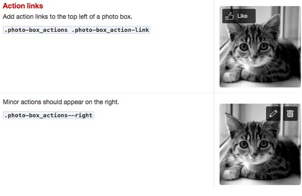
As you can see in the below example from the Yelp Style Guide, these are the most direct and strict patterns, and the rules tend to be black-and-white: a search box should be in the upper right-hand corner, form labels should be directly under the field box, etc.
2. Flow
As explained in the free e-book Web UI Best Practices, a step above implementation patterns are patterns that assist the flow of the user experience. At this level, patterns become more advanced, and are concerned with how they help the user move through the site to achieve their goals. Would a Jump-To or Sticky Navigation work better to help users access additional content? Given your target user and site genre, what’s the best way to receive input? In essence, these patterns are more flexible and customize your site to your specific needs.
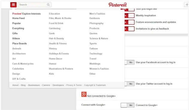
Let’s take a look at examples below from Spotify and Pinterest.
User Problem: I want quick access to additional options or actions on the site, but I don’t want to feel paralyzed by too many choices.
UI Pattern Solution: Hide additional options in an expandable menu so they don’t clutter the main interface.

3. Context
Patterns of context are specific to the type or genre of site you choose.
For instance, let’s say you’re building a site for a professional entertainer: you’ll need to include patterns like an event calendar, biography, and portfolio. If you’re making a e-commerce site, you won’t need an event calendar, but you won’t get very far without a checkout system.
Now let’s look at a real example. Virgin America requires a UI pattern for its booking form (an advanced user input pattern) because it’s in the airline business. Obviously, something this complex isn’t needed for a social site like Pinterest or Twitter.

4 Steps to Using the Right UI Design Patterns
Before you lay out the fine details of your web interface — how users input data, how the site provides feedback, etc. — first you need to determine the visual hierarchy of your site.
Knowing the look and feel of your site will help you realize which patterns will work for you. Once that’s established, you can start the process of selecting UI patterns.
The selection process can be simplified to four basic steps:
- Determine the problems that need to be solved.
- Explore how others have solved the same problem.
- Examine the solution’s use on other sites.
- Detail the patterns proper usage so you can recreate it.
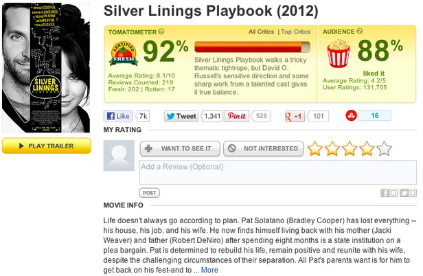
The above process is focused on finding patterns, but how do you decide what patterns are right for you? Melissa Joy Kung, Editor-in-Chief of Technori, elaborates on the process in her post about the topic. She illustrates her points through the example of a “ratings” style pattern used by Rotten Tomatoes:
1. Define the UX pattern — First and foremost, you should understand what the pattern does. The main functions of the ratings pattern are to give users quick feedback, allow the user’s voice to be heard, and collect qualitative and quantitative user data.
2. Find the pattern used well — Search the web until you find a site that uses the pattern particularly well, in this case, Rotten Tomatoes. This can be used as a reference guide later.
3. List the problems the pattern solves — Similar to defining the main functions of a pattern, it’s important to know which problems they target. The ratings pattern satisfies feedback, improves interactivity, and it gives the users’ opinions more weight, which they appreciate.
4. Know when to use the pattern — This goes back to our earlier discussion of UI patterns for context. A ratings pattern is used when your product requires additional feedback, or when you want to expand on existing feedback like a written review — but it wouldn’t make sense on a journalistic blog.
5. Know how to use the pattern — In this stage, you get into the technical details of a site. The ratings pattern utilizes an aggregated average of the user ratings, an option to change the rating later, a display that lights up when you hover on it, a cue to let the user know their rating is accepted, etc.
If you’d like to learn more, check out our free Web UI Patterns 2014 e-book which breaks down and explains 63 UI patterns in depth.
UI Design Pattern Libraries & Resources
Unless you’re a hardened UI designer with years of experience, it’s hard to keep track of all the UX patterns at your disposal.
Below are several resources that collect and compile all the latest and most useful patterns. These can help you stay up-to-date, which we all know is very important in a fast-moving field like web design.
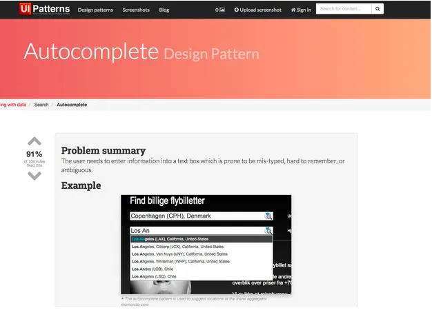
1. UI Patterns
A web pattern library that has an organization system for easy browsing. Fun fact: it was just recently redesigned and restructured.
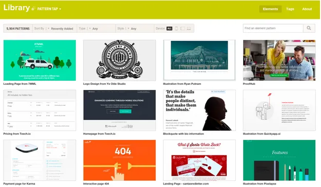
2. Pattern Tap
This designer community posts and updates lots of helpful resources for web design education (since it’s part of ZURB University).
3. UXPatterns
See low-fi to hi-fi transformations of designs from top companies like Lyft, Uber, Pinterest, and others. Click on the patterns to use them for free in UXPin.
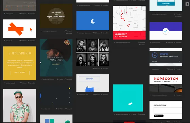
A fantastic infinitely-scrolling library of GIFs that show the interactive power of UI patterns.
5. Capptivate
An exhaustively thorough collection of mobile UI patterns. Almost all of them are animated, so you can see how to layer interactions on top of popular patterns.
Additional Resources
For even more detailed listings on UX patterns, Smashing Magazine posted a list of over 40 online pattern libraries.
If want to bring UI patterns to life, give UXPin a try with our free trial and explore our more than 900 UI templates and patterns.

