Modal UI Dialogs and Windows: When Should You Interrupt User Flow for Your Own Benefit?

Most designers do everything possible to give users streamlined experiences without any interruptions. Sometimes, though, it makes sense to interrupt the user flow with a modal that triggers the user to do something on a website or in an app.
The following article explains various cases in which it makes sense to use modal UI dialogs and windows. Knowing the right moments to interrupt the user experience can actually add to your product’s effectiveness. You need to take a savvy approach to make the most of modal design without annoying users, though.
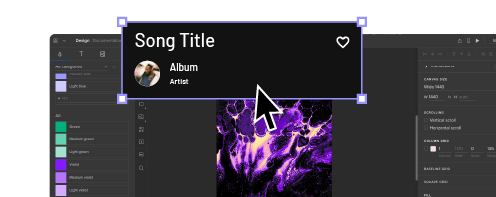
Design modal UI in UXPin, one of the best, end-to-end design tools. Build advanced prototypes with features like expressions, conditions, and more. Explore it capabilities at trial. Try UXPin for free.
What Are Modal UI Dialogs and Windows?
Modal UI dialogs and windows are large boxes that cover entirely or partially the main window until the user performs an action. They work like pop-up windows. Unlike most pop-up windows, though, users cannot continue by clicking an X and closing the box. Instead, they must take an action that tells the website or app how to behave.
As a designer, you probably don’t like the idea of interrupting a user’s experience. You want to create a seamless product that simplifies complex tasks. You might also have aesthetic reservations about UI modal designs. When a window interrupts the main window, it also interrupts your design.
When you think beyond the immediate experience of encountering a UI dialog, though, you can discover ways that the interruptions actually improve user experiences.
Modal designs can also help your product acquire the information that owners need to make money. Even if you despise the interruptions that modal UI dialogs cause, you must accept that designers can only work when they have clients willing to pay them. If that means adding a few interruptions, then you have to do it.
That’s also why we put together the following examples to show you that modal dialog has a place in cohesive, pleasant designs.
Use a Modal UI Collect Information and Generate Leads
Many apps and websites collect information from users so they can generate leads for clients. When someone visits an app like Instagram, they have limited access to content until they create an account.
If you try to scroll too far into the content, a modal dialog box will appear and ask you to either log in or create an account.
Creating an account gives you access to all of the public images on Instagram. You have to give Instagram your email address to create an account, though. It uses this information to stay in contact with you. Depending on how often you use the platform, you may get daily or weekly emails with updates about your account and friends.
Lead Generation for Ecommerce
Instagram doesn’t want to sell products or services to you. It just wants you to visit its platform so it can earn advertising revenue.
Ecommerce sites, however, use lead generation in a different way. Their modal dialogs ask you to enter your contact information to create an account. Companies can then use your information to let you know about products, services, and specials that might appeal to you.

With this type of lead generation, companies hope to make money by getting you to buy something. With the modal UI, they would miss opportunities to generate the income needed to grow and serve their customers.
Helping ecommerce sites generate leads and improve buying experiences will always play some part in a product designer’s work. Learning how to meet your client’s needs will help ensure that you continue getting work.
Ideally, you should also learn how to write microcopy that converts users. Choosing the right messages can make a significant difference in your dialog box’s effectiveness.
Break Complex Actions Into Smaller Steps With Modal Dialogs
Product designers cannot assume that all users have a lot of experience using websites and apps. Even though 81% of Americans own smartphones, you can’t assume that all of them have used their devices for anything other than placing phone calls. You certainly can’t expect all of them to know how to complete complex actions online.
Modal windows can break complex actions into small, manageable tasks. Instead of confronting users with unrealistic expectations, modal dialogs can take small steps to reach a complex goal.
Let’s use Asana login as an example. It’s a user-initiated modal that doesn’t launch until the user asks it to. Asana must ask several questions to create your account, including:
- Your name.
- The type of work you do.
- An introduction to setting up your first project.
- Your billing information.
By spreading out these and other steps, new asana users get to create accurate profiles and learn the basics of setting up their first projects. If the website asked all of these questions and presented all of the instructions at once, users would feel assaulted by information. Asana’s approach makes it easy to focus on each step without feeling overwhelmed.
Position Modal UI Pop-Ups in the Right Places
Pop-up windows need to appear in the correct place to grab the user’s attention and encourage action. Twitter offers a great example of modal UI screens that pop-up in just the right places.
Notice that the pop-up doesn’t fill the entire screen, so users still know which service they’re trying to use. Instead, it covers just enough of the area to demand action.
The position matters quite a bit, too. Pop-ups can work well in different places. Twitter gets it just right by positioning the modal UI in the center of the page. Each user gets confronted with an account request that asks straightforward information. The fields also give people plenty of room to answer questions completely.
On a mobile device, the pop-up appears on the upper-half of the screen. This ensures that the user sees the modal pop-up before scrolling down. If the pop-up appeared elsewhere, users might miss the interaction, which would leave them wondering how to create accounts.
Use Modal Design to Prevent Errors and Correct User Mistakes

When trying out new products, most people jump into the experience instead of looking for instructions. Designers should recognize the impulse as a part of human nature.
Modal design gives you a whimsical, non-judgmental way of saying, “You didn’t do that right at all!”
The above UX automation tells the user that a download has failed. Maybe the user caused the failure. Maybe the failure came from somewhere else. What matters is that the animation makes the failure amusing.
You can imagine similar modal dialogs that say something like, “Oops! You forgot to attach your file!” or “Could you check that address again?”
Suddenly, the interruption doesn’t come across as judgmental. It acknowledges a mistake that happens all of the time and asks the user to try again.
Let Modal Windows Direct Users to the Right Features
Some websites and applications need users to complete specific actions before they start working. If the user doesn’t follow instructions, the feature becomes useless. At this point, frustration kicks in and the user navigates away to find a product with a more intuitive interface.

Imgur gives you an example of an application that makes it easy for users to understand what steps they need to take to reach a goal. When a user wants to upload an image to Imgur, they see a modal UI dialog with several straightforward options. Technically, the user can X out of the dialog box, but they will get sent back to the homepage.
Assuming that the user wants to upload an image, they can choose between:
- Drop images here
- Choose photo/video
- Paste image or URL
It doesn’t get much simpler than that.
Yes, the modal design has interrupted the user experience, but to perform an essential task. A window pops up that says, “I’m here to make this easy for you! What image do you want to add?”
Without the modal dialog, users would need to search for an icon or command to upload images. The interruption saves time and prevents frustration. That makes it a necessary part of Imgur’s success as a free image hosting service.
Add Critical Modal UI Dialogs With UXPin’s Design Tool
UI modal windows interrupt user experiences, but they do it for good reasons that make products more enjoyable.
Unfortunately, it’s easy for designers to misread their target audiences. What one person finds amusing or helpful could offend someone else. UXPin gives you the right tools, such as interactions and animations to test your modal UI dialogs and windows to make sure they do their jobs well.
Use UXPin’s design tool to create an interactive prototype of your product. Your prototype can accept real information from users, so it feels completely lifelike. Test your modal UIs by sharing your designs to colleagues, friends, and stakeholders for feedback. Start your free UXPin trial today.


