This post is an overview of why we recommend mockups, covering some of the points in our free pocket guide Web UI Design Process: The Visual Power of Mockups.
We’ll start by explaining what they are, then why they’re useful, and finally where they can fit into your design process.
What is a Mockup?
Before we get into what a mockup is, let’s talk about what it isn’t. A mockup is not a wireframe and it’s not a prototype.
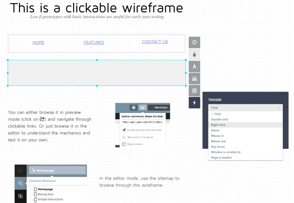
Wireframes are a low-fidelity blueprint represented with gray boxes and placeholders for detailed content. A skeleton of the design to come, wireframes act mainly as a placeholder for structure and layout but can be shown to stakeholders for early feedback.
Prototypes, on the other hand, demonstrate how the design works. Their role in the design process is more complex: they help refine usability, explore combinations of interactions, and reveal any inconsistencies in the overall experience.
Source: UXPin
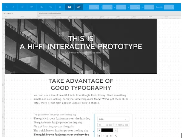
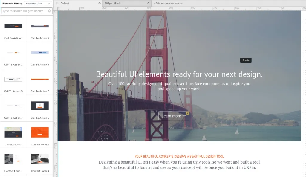
Typically a mid- to high-fidelity representation of the product’s visual appearance, mockups focus mainly on the visual look of the product but also hint at the basics of its functionality. The main role of mockups is the visual design — this phase solidifies the product’s color schemes, typography, iconography, and the atmosphere created from its appearance.
Mockups give viewers an idea of how the final product will appear, and the implementation of interactive elements like buttons and icons also hints at the function. Of course, mockups don’t actually represent the functionality like a prototype.
As such, mockups have an advantage lower-fidelity wireframes and prototypes lack: mockups are more digestible to clients stakeholders. With a well-made sample in front of their eyes, stakeholders don’t have to rely so much on their imaginations.
More complex than a wireframe but less functional than a prototype, a mockup fits perfectly as a transitional step between the two.
Why Do Mockups Matter for UX Design?
As we mentioned before, the mockup phase is often tossed aside, especially if designers prefer the Lean UX rapid prototyping method. But if you have the time and resources, mockups are the best way to explore visual design decisions before you need to live with the consequences of code.
Avoid mockups, and you risk visual quality falling through the cracks.
In his brief overview of mockups, the freelance web designer and design author Bima Arafah elaborates on why mockups are worth the effort:
- Analysis — Mockups can help reveal any clashing visual elements while it’s still easy to change them. Moreover, by dedicating an entire phase to visuals, you’re able to fully flesh out your ideas and choose the best possible options.
- Editing before code — Furthering the point made above, these critical visual decisions are best answered at this point in the process before coding begins. Edits made at this point at far easier than later in CSS or HTML.
- Design implementation — How does your initial design perform? From a usability perspective, a mockup lets you test the visual details and change them before it’s committed to code.
A lot of the criticism against mockups comes from the time and energy it takes to create something that eventually needs to be rebuilt in HTML or CSS. And unless you’re using a prototyping tool, you’ll likely need to start all over again with your prototype (since you probably created your mockup in Photoshop or Sketch).
How Do Mockups Fit Into the UX Design Process?
While everyone enjoys the freedom to alter their design process to suit them, in general we’ve experienced two main strategies for how mockups can fit into the design process.
The first is the standard process that you might have already guessed:
1. Wireframe => Mockup => Prototype
This is the common point A to point B format.
First, your basic layout and “content buckets” are determined in the wireframing phase. Once you have a basic idea of where everything goes, you can dive into the visual details.
As you move from wireframe to mockup, you finalize graphics, color schemes, and the general visual atmosphere of your site or app. At the same time, you’re able to start planning the functionality and interface. Once the mockup is finished, you’re able to start developing the first interactive prototypes (either in code or much faster with a prototyping tool).
The fidelity of this process is no set in stone. Most wireframes will be low fidelity, but your mockup could be mid- to high-fidelity, depending on your time and constraints. Likewise, the prototype’s fidelity could be as low or as high as you’d like.
Part of the reason we created UXPin was to help adapt to the fluctuations of fidelity and functionality. For example, you could start with a wireframe in UXPin. Then, as you progress to mockups, you can either create the visual design in Photoshop or Sketch or add fidelity to your wireframe with our element libraries.
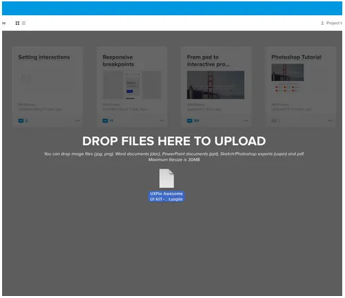
Once you start creating your prototype, you could then import your Photoshop or Sketch file into UXPin, or just add interactions to your existing design in UXPin with a couple of clicks.
However, it’s always a good idea to test the functionality with a prototype as early as possible.
So, how do we modify our process to prioritize usability and interaction design?
2. Wireframe => Lo-fi Prototype => Hi-fi Mockup => Hi-fi Prototype
In this method, you begin prototyping immediately after wireframing.
This lets you run usability tests and fix functionality issues before the design risks going off track. From the testable prototype (or simultaneously, in some cases), you’ll have a more usable foundation from which to layer the visual design. Once the visual details are finalized and the mockup finished, you can either implement them into the prototype or jump straight to developing the final product.
This early integration with functionality works well for projects with experimental or potentially complex functionality. This method can also use a coded version of the mockup, which we discuss in the The Guide to Mockups.
Let’s examine how you could follow the usability-first design process. You can start by creating your wireframe in UXPin. Then, add interactions by clicking on each element. You could then test this prototype, or continue towards the visual design by adding more elements from the libraries or move to Photoshop and Sketch.
Once you’re done with the visual design, you’re ready to create a high fidelity prototype.
If you used Photoshop or Sketch, just import your file into UXPin (all layers are preserved). If you worked in UXPin the whole time, then all you need to do is add more elements from our libraries to create the high-fidelity prototype.

Alternatively, you can also complete this entire process with a mixture of Photoshop/Sketch and your coding language of choice, but we wouldn’t recommend that unless you’re extremely technically proficient. When in doubt, always ask yourself how many designs you could explore and perfect with 30 minutes of code versus a design tool.
Conclusion
As a transitional phase between wireframes and prototypes, mockups help designers by allocating time strictly to visuals. As mid- to high-fidelity representations of the final product, mockups help stakeholders immediately understand the final form of the product.
Of course, this is just a general introduction to mockups. For additional practical advice on mockup process and best practices, download the free pocket guide Web UI Design Process: The Visual Power of Mockups.


