Interaction Design (IxD): The Next Step for UX Designers

There is no single definition for interaction design. However, much of its character shapes digital products, services, artefacts, and spaces with a strong emphasis on user experience. The field is broad, user interaction is diverse and dynamic and involves aesthetics, motion, sound, space. With these elements becoming more granular, i.e. sound design for the crafting of sounds used in user interactions (games, installations, industrial work areas). IxD takes a multifaceted view on the social, cultural and business context for which a digital artefact resides.

What is Interaction Design?
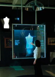
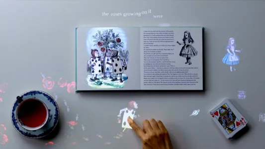
Interaction Design is essentially the practice of designing interactive digital products, environments, systems, and services. It focuses on creating a flow where a user can locate and manipulate information quickly and in a succinct manner. The notion of usability in a digital product is often associated with good interaction design. Ultimately a design is a plan to make something new for people that they perceive as beneficial and IxD examines the interaction (via an interface) between a system and its user. Interaction Design is heavily multidisciplinary with labs usually containing a mix of disciplines such as computer science, HCI, anthropology, industrial design, informatics, and applied physics and electronics.

User Experience (UX)
Interaction Design and UX is used homogeneously in cultural discourse. There is no doubt the two disciplines share many characteristics. A large section of UX concerns a user interacting with a product, however the two are not synonymous. UX Design is a higher-order concept that encompasses numerous design aspects along with a user’s journey on a system, platform, software, or application. It includes UI design, Ix design, communication design, application design, information architecture and more. The goal of UX design is to induce a positive feeling for the user when operating on the device – this encompasses a wide variety of disciplines and techniques. Whereas Interaction Designers are concerned with the moment a user interacts with a product; their objective is to improve the interactive experience. The moment of interaction is just a part of the journey for a UX designer; UX must focus on all user-facing aspects of a product or system. The IxD designer focuses on the choreography of the interaction; if the exchange is quick, intuitive and pleasurable, their job objectives are satisfied.
What Is Good Design?
What does good mean? Is it possible to measure or analyze? The answer is not black and white, but some characteristics pertain to good design. When we interact with everyday artefacts, like a car, we don’t waste mental energy analyzing the interaction: we think about where we’re heading and what we want to do. The interaction is intuitive; removing the conscious thought needed to operate the system, leaving us to concentrate on our goals. When one designs a computer-based system or digital artefact, they’re focusing on how it behaves and not just aesthetics. The quality of interaction is more important, and this is the skill of the interaction designer.
Consistency
Consistent design is intuitive design. A specific command in one part of the system should initiate the same response in another position. The Apple II is an example of this; one knew what to do at all times. A command in the database behaved the same within the word processor; one was never lost and rarely made a mistake, regardless of your position within the system the escape key took you back up a level – consistency promotes user learning and avoids confusion. Compare this with contemporary “integrated” applications. Consistency and simplicity is a difficult combination to attain but when executed, produce timeless affectionate tools for the human race. Check out our webinar on Balancing UX Consistency for a practical deep dive.
Perceivability
Perceivability invites interaction and acknowledges that our experience of any interactive product must first pass through our senses. If an interface can engage the user’s senses, it will inherently be more comfortable for the user to perceive and understand the elements use case and how to performs actions with it – the louder the voice of a satnav, the stronger the vibration of a mobile phone or the bigger an icon on a screen; each stimulus catches the users attention and elucidate subconscious meaning. Obscured interfaces and interactions decrease usability and intuitive play; one must not have to guess or act out of desperation or rely on luck and random discovery, the user should be able to interact with the system intuitively without conscious thought.

Affordance
Affordance is essentially the perceivable characteristics of an object, for example, shape, size, colour, location or texture, which determine the tactile possibilities of the artefact; it is possible to stretch the concept of affordance into the virtual world. A physical button affords to be pushed down. The virtual representation of a button on a website evokes the affordance inherited by the physical object it evokes, elucidating to the user that they can press it (i.e. click on it).
Constraints
Constraints limit the range of interaction possibilities for the user; restrictions prevent users from following dead-end paths, making mistakes, and of course, it guides the user to make the appropriate next action. Constraints clarify direction; limitless possibilities confuse. For example, on particular pages, the menu items of a website may be temporarily disabled. A technique to mitigate against this and avoid frustration, may include greying out items to signal that it’s inoperable or defective.
Feedback
Reassuring feedback is central for interaction design, how does one know when an action is initiated and if it has been successful or not. Let’s take the humble keyboard as an example; we understand the implications of our actions. by the characters appearing on the screen and the tactile sensation of pressing keys and of course, the aural feedback.
Navigation
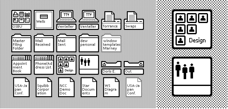
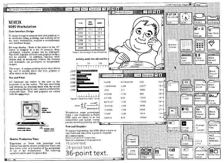
One needs to orient oneself within a system, intuitively knowing how they can go somewhere and how to get back – Macintosh and Xerox Star interfaces led the way for screen-based systems. A 1982 paper describes how The Star user interface differs from alternative office computer systems of the time with its emphasis on graphics and adherence to the metaphor of a physical office; of course it’s rigorous application of a small set of design principles. It is clear how one navigates and travels within the system.
Usability
Usability in a digital artefact correlates with good interaction design; usability design aims to improve the usability of a product and is regarded as user-centred design; this includes several essential elements – usability testing, based on the target users psychological research – user model and needs, the use of processes, etc. Cognitive Psychology, Ergonomics, Industry Psychology and various other disciplines are applied iteratively to distil the most suitable and practical design for the end-user. Designing a usable system requires intimate knowledge of human psychology in the context of digital interaction; check out our e-book bundle – Psychology Principles for WebUI Design.
Coming full circle, the following list by Jakob Nielsen’s(aka “the king of usability”) outlines ten general usability principles, more commonly known as Nielsen’s “heuristics” – use this as a pragmatic cheat sheet; if a product has a strong usability foundation the remaining design will emerge effortlessly.
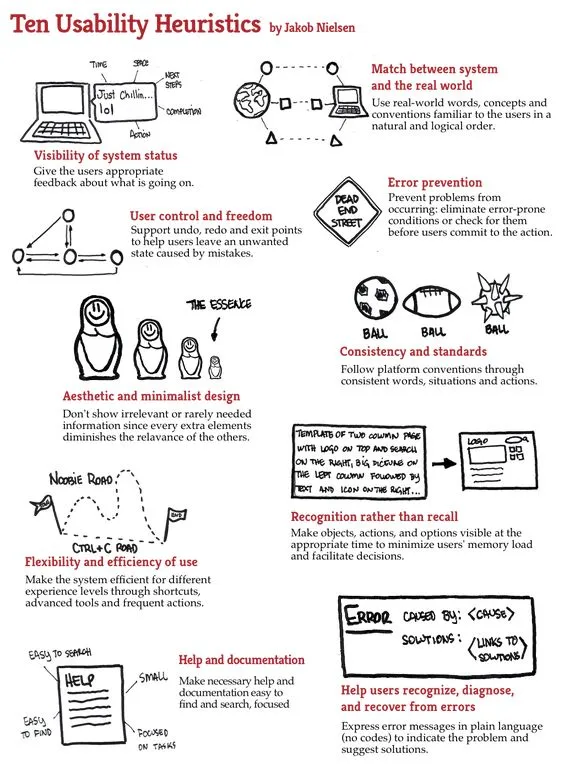
Visibility of System Status
Users must be at all times informed about what is going on within the system, using appropriate feedback techniques within a reasonable time frame.
Match Between the System and the Real World
The system should speak colloquially, and the flavour of speech should not be system-oriented.
User Control and Freedom
Users do not always make the best choices and must have the facility to undo and redo; emergency exit and cleanup procedures must be easily accessible.
Consistency and Standards
Users should not have to second guess standards within the system; specific actions should do the same things throughout the platform – actions need to be consistent.
Error Prevention
Design the system in a way that it is difficult for the user to break (the user should not be able to harm), safeguards should be put in place to prevent system meltdown and misuse.
Recognition rather than Recall
Reduce the user’s memory and cognitive load by making objects, actions, and options visible.
Flexibility and Efficiency of Use
Create multiple paths within the system wherein expert, and novice users can navigate in an accelerated or slow manner. CLI(Command-line Interface ) vs GUI (Graphical User Interface).
Aesthetic and Minimalist Design
Follow the principles of KISS(Keep It Simple Stupid ) and Occam’s razor. Everybody hates bloatware. One useful approach is applying the You Ain’t Gonna Need It principle, or YAGNI for short: leave out all the things that seem nice-to-have, but you have no proof you need.
Help Users Diagnose, Recognize and Recover from Errors
Error messages need to be in plain English (no error codes) and should be solution orientated, guiding the user to recovery.
Help and Documentation
A system must be completely intuitive, requiring no manual or second-guessing, but there are always edge cases where complex tasks need further explanation, in a more granular manner. An instruction manual should be easily accessible—for example, Linux MAN pages.
Create and Share UX Designs With UXPin
When it comes to prototyping tools that support your UX processes and methodologies, look no further – UXPin does the job perfectly. It is full of design, prototyping, and collaboration features to let you and your team align and work in context. UXPin lets teams work on the same design – not only designers but also stakeholders who don’t have an account can collaborate. This takes so much frustration out of the review process and puts an end on the never-ending emails with feedback. All you have to do is send someone a preview link so that they can start reviewing the design.
Check out how UXPin stacks up against competition.
Start with a free UXPin trial to discover and try all the features yourself.

